As a Dutchman, I had hoped for a pleasant Christmas. Instead, we Dutch were confronted with bitter news: the glorious font Calibri, designed by the legendary Dutch typographer Lucas de Groot, is being cancelled by American Secretary of State Marco Rubio.
Secretary Rubio has ordered that all official communications of the US government must no longer be set in Calibri but revert to Times New Roman. His reasoning? The earlier adoption of Calibri was, according to Rubio, a ‘wasted step in the area of diversity’, and a return to the traditional serif typeface would restore ‘dignity and professionalism’.
Is Calibri—our Dutch national pride—now being dealt the ignoble woke card?
Let us first establish the facts. Calibri is a sans-serif typeface designed in the early 2000s by Lucas de Groot at Microsoft’s request. From 2006 onwards, it became the default font in Microsoft Office and thus one of the most widely used typefaces in the world. In January 2023, under former Secretary of State Antony Blinken, the US government also adopted Calibri as the standard for diplomatic and other official documents, citing improved on-screen readability and better accessibility for people with visual impairments.
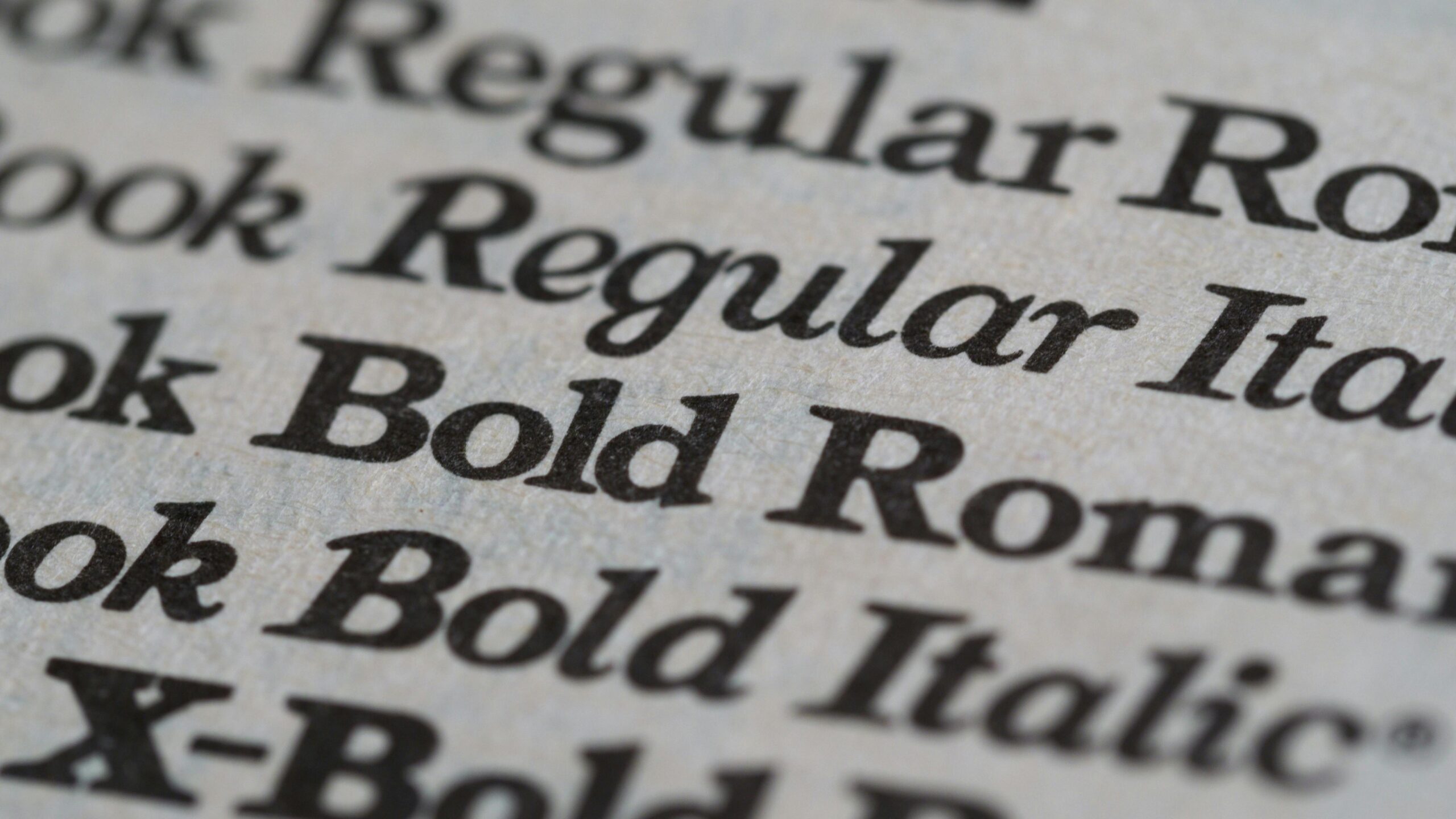
Times New Roman, by contrast, is a serif typeface dating back to 1931, originally designed for the British newspaper The Times. For decades, it was the default font in Word before it was displaced by the youthful upstart Calibri.
Rubio’s cancellation of ‘our’ font has not gone down well in the Netherlands; all the more so because it is the Christmas season, a time in which one hopes for goodwill rather than typographic affronts. If there is ever a bad moment for a nation-offending, distinctly un-Christmas-like decision, this is surely it.
‘Calibri is allegedly too informal and emblematic of what [Rubio] regards as superfluous diversity initiatives’
Secretary Rubio maintains that Times New Roman conveys tradition and professionalism, whereas Calibri is allegedly too informal and emblematic of what he regards as superfluous diversity initiatives. De Groot responded with understandable indignation, calling the justification ‘sad’, and pointing out that Calibri was chosen precisely because it reflects contemporary reading habits and accessibility standards.
The typographic distinction itself is straightforward. Serif typefaces such as Times New Roman feature small strokes—’serifs’—at the ends of letters, traditionally associated with established style and readability in print. Sans-serif fonts like Calibri dispense with these ornaments, resulting in a cleaner, more modern appearance that is often easier to scan on digital screens.
As a Dutchman, I cannot deny that I view the American cancellation of our national typeface with mild astonishment. In the festive month of December, such a diplomatic font switch feels like hanging a message on the Christmas tree that has nothing to do with peace on earth, and everything to do with serifs versus sans-serifs.
Just kidding! Scrap all of the above. Of course, Calibri is ugly beyond belief! It is a modernist abomination. Where are the ornaments? Sir Roger would have been physically unwell at the sight of Calibri elevated to bureaucratic standard. Making Calibri the official font is a little like those German cities where, due to municipal regulations and environmental legislation, magnificent historical façades are torn down. That is not something a civilized society should do.
One may debate Garamond versus Times New Roman, but Times New Roman versus Calibri?
Come on.
Related articles: